I see there have been a number Bash tips posts on Hacker News recently.
Let me share an improvement for the shell I made myself only lately.
Grand Design
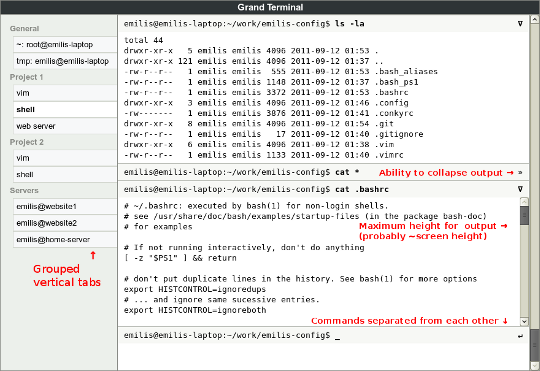
First a little explanation: I have a vision of how I would like my terminal application to look like:
This design would work very well with the overall UI configuration on my Ubuntu box (I have panel and taskbar on the left, use Tree Style Tab for Firefox, Zim desktop wiki).
Pathetic Implementation
My problem is that I don't have the necessary time and GUI development experience to implement this myself.
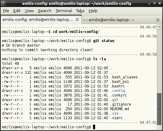
So a couple of weeks ago I made myself a crutch -- tweaked my Bash prompt. It now looks like this:

Although I didn't add much (just a separator line and bold style for command text) it took me some time to play with various colours and styles to achieve this effect.
The Code
I have put the configuration file on GitHub here.
I saved the file in my HOME directory and link it from my .bashrc like this:
if [ -n "$PS1" -a -f "$HOME/.bash_ps1" ]; then
    . "$HOME/.bash_ps1"
fi
Words of wisdom
I bet some of you will now go and play with your Bash prompt configuration. Let me offer you a comment by some unnamed Ubuntu/Debian maintainer wizards I found while playing with my .bashrc:
# uncomment for a colored prompt, if the terminal has the capability;
# turned off by default to not distract the user: the focus in a terminal window should be on the output of commands, not on the prompt
# force_color_prompt=yes

Comments
Bert Vermeulen
Mithrandir
Emilis Dambauskas
Mithrandir
Jason
Gary
@jason_lindberg
n49o7
fraterneo
Ammar
Agvztíñ IV
zzzzz